My current client is extremely interested in how “us vs. them” dynamics manifest in language. Most manifestations are subtle, but I’ve spent so much time in that headspace that I’m now getting insight flashes from Critical Discourse Analysis everywhere I look. I gotta say, actually seeing these power dynamics is like having my eyes opened to something I expect I’d have been happier not seeing. (It all reminds me of the Matrix. Or maybe Amazing Grace would be a better analogy. Something between the two, anyway.)
Here’s an example that I can’t stop thinking about. I visited the “Written in Bone” exhibit at the Smithsonian Museum of Natural History. One of the exhibits was a set of 3 skulls – a Native American skull (left), a European skull (center), and an African skull (right). I think the message they were aiming for was “everyone’s background is written in their skull” – a fitting message for an exhibit about skeletal analysis, forensics, and what bones can teach us about history.
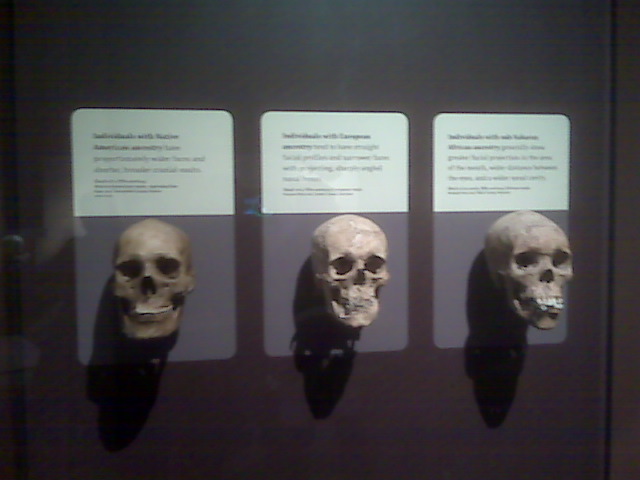
I took a poorly lit and poorly focused shot of the "ethnic skulls" display.
The display text is:
- Left: Individuals with Native American ancestry have proportionately wider faces and shorter, broader cranial vaults.
- Center: Individuals with European ancestry tend to have straight facial profiles and narrower faces with projecting, sharply angled nasal bones.
- Right: Individuals with sub-Saharan African ancestry generally show greater facial projection in the area of the mouth, wider distance between the eyes, and a wider nasal cavity.
Interesting facts! But the language choices stopped me cold. The text gives the Native Americans and sub-Saharan Africans a series of comparative “-er” adjectives. Every time a “distinctive feature” is mentioned, it is as a comparative (to something else that goes unnamed). But the European language is different. Three of the four adjectives are pure, non-comparative words. To boot, the visual design also echoes “European-as-normative” in its use of the (literally whiter!) European skull as the centerpiece.
Likely the visual design was deliberate – museum designers certainly are well-versed in visual metaphors – but I would be surprised if the author really intended to say, “I am white, and I am designing this exhibit for white people”. It might be true, but that message is so blatantly racial that it’s hard to believe anyone intends to give it in 2010.
It’s hard to unsee the constant unintended us-vs.-them signalling baked into human communication once you start seeing it.