Tag: data-analysis

Data documentation and me

When I start wrangling a new data source, I search for a lot of terms, I ask a lot of questions and I take a lot of notes. I like to publish those notes on the company wiki. By working publicly, the quality of the docs tends to improve – no one has to re-invent the wheel, I sometimes get comments that improve the docs, and there is a clear stub for others to maintain.

These notes often find their way to becoming onboarding directives (“go read these pages to learn about our data”), and they’re valuable to skim when revisiting data.

When I was in a highly mature data science organization with weak engineering practices, everyone was building on everyone else’s data and data documentation was useful in tracking alternative datasets and tracing back to canonical sources. Now I’m in a maturing data science organization with strong engineering practices, and these documents are useful because they stop the data users from annoying the engineers with the same questions repeatedly.

I’ve landed on a general template while documenting many, many dozens of datasets. I want to share it in case it can be useful to someone else.


$typeOfData data documentation

The page naming convention supports searching for “X data”.

The first section is a very short orientation (ideally 1-3 sentences). It gives just enough for the reader to figure out if the data are relevant to their task. When the dataset scope is complex, this section tends to be a bit longer to explain what is (not) included.

Background

This section varies in length. It covers anything that isn’t immediately apparent that someone might need to know, such as:

  • Where do these data come from? Do we have any contractual or PII obligations?
  • How does the system that creates these data work? (for instance, how does Tor work, how does network communication work, why would a certificate be revoked, what is domain registration)

Summary of dataset

This section contains a short paragraph or small table that always give the most basic facts:

  • Where can you find the data?
  • What time period do the data cover?
  • How often is the source refreshed? By whom?
  • Roughly how large are the data on disk (per unit of time)?
  • Who is the best POC team(s) for this data? (useful in itself and as an indicator of data maturity)

Organizations sometimes keep multiple of the same data. Maybe that looks like Parquet and .ndjson and Avro copies of every file. Maybe that looks like GCS and BigQuery and Databricks. Maybe that looks like something else entirely. I get opinionated here. I think it’s unreasonable to document all of those, so it’s important to decide which approach is the most “organizationally canonical” source and write a data documentation doc that reflects only that canonical source. (And I think the source itself should have documentation on it that discusses how it is loaded.)

Fields

This section is the core of the documentation. It contains a very, very long table. Each field gets its own row. I use three columns:

  • field name
  • example values
  • notes

The examples must be edited to be notional. The company wiki never has the same controls as R&D systems do, so I always edit the examples so they do not actually appear in the dataset.

The “notes” field is the core. This is where I capture relevant facts, like whether this field is sufficient to be a primary key, whether it’s a hash of another field, whether it’s an enum masquerading as a string and how frequent each value is, whether it is actually the same as the field with the same name in that other dataset, whether it’s a dirty raw version of some other field, ….

I often stub out a row for each field, and then I fill in example values and notes as I work with each field.

Limitations and gotchas

This section reiterates the most frequent mistakes that someone is likely to make with this data. I often fill the entire section with a handful of very short bullet points.

It includes big-picture gotchas. What kinds of data will not be visible in this dataset? What kinds of mistakes will people make? (This is the place I underscore the implications of what is already documented – “remember to deduplicate when you JOIN on this data, or your join will explode”.)

It also includes the most important field-level gotchas (“the domains in this dataset always have a final period postpended, which means all naive JOINs will falsely fail”).

Since different people read different things and duplicating warnings is usually valuable, I think the repetition is worthwhile.

Usage

When the datasouce is canonical but opaque and there isn’t organizational interest in maintaining either a usable copy of all the data or a centralized query library, it can be useful to provide an example bit of SQL or Java code. I write a bit of code that massages the data into a useful format while correctly avoiding the gotchas. If the organizational appetite for data maturity is there, that’s even better; do that instead.

This section distinguishes these data from similar data sources. It also curates links to any other related data that someone might not even know they were looking for (e.g., WHOIS might link to DNS data as a source of FQDNs rather than only SLDs).


And that’s that. I don’t use all the sections every time, and I sometimes move them around, but I do tend to keep to this structure. I find public documents in a consistent structure to be very valuable for working with data.
Detecting live security threats without internal data: Netflow and building the Behavior product

We were awarded a patent for Behavior, Qadium’s second product, which I designed, architected, and built as applied research! We sold my BigQuery-based implementation for roughly a year to the tune of >$1 million in ARR – a big deal for a startup. As soon as the value was visible, we staffed it with multiple engineers, converted it to Dataflow, and cranked up a UI.

The core insight inside Behavior is the same as the core insight of our first product, Expander, and the core business of Qadium: We can help you monitor everything that your organization has connected to the internet, and we can do it without deploying any physical devices or software agents. It turns out most organizations have all kinds of unexpected and unwanted systems connected to the internet. Qadium products give you visibility into what isn’t under management and what is misconfigured, and Behavior extends that unprecedented visibility to live interaction flow data.

Challenges with using netflow data

Behavior detects otherwise-undetectable security threats by operating on netflow data. Netflow data is very basic metadata about what communications are traversing the public internet. In netflow data, we have only a few fields: the source and destination IP addresses, the source and destination ports, the layer 4 protocol, the timestamp, and any TCP flags. These aren’t much to work with. Worse, the modern internet multiplexes many domains and even organizations to shared IP addresses, so the data aren’t definitive.

Netflow data capture only a very small fraction of a percent of all traffic (on the order of 1 packet in 1 million), and the sampling is entirely by convenience. Most routers and switches retain some netflow records as the traffic passes through them, but each system has very limited memory, and quickly handling traffic is their priority. So, dropped records are unavoidable, and dropping behavior varies by characteristics like node identity (network position) and time-of-day (data volume). We also see non-negligible duplicate records, because a single client-server conversation might be observed by multiple sensors. “Chattier” types of interactions (like audiovisual communications) are over-represented. Adding more complexity, which IP is considered the “source” of the packet is essentially arbitrary for our purposes.

Additionally, because Qadium doesn’t have access to internal firewall logs, we don’t actually know what truly happens to risky flows. We don’t know whether the organization’s firewall blocked the risky connection (as it should), nor do we know which machine ultimately received or initiated the flow.

My challenge was: Can we say anything valuable about an organization’s internet security risks from such a limited dataset?

What I built

I focused on one fact. When we see a flow, that interaction happened.

First I verified that fact was indeed true. I ran an experiment. I took a set of otherwise-quiescent IP addresses, and I sent a zillion packets to a random selection of even-numbered IP addresses. I observed how fast we observed netflow records for those interactions (quite fast), and I verified no packets were hallucinated in the multi-day window. I saw no traffic, a spike of even-numbered packets for a few minutes, and then no traffic again.

To be able to use the fact that observations always reflect real traffic, I had to transform the data. I first converted its column names to be meaningful – from “source” and “destination” to “likely client” and “likely server”. I used the port numbers for this translation. (Low ports and known ports are servers; high ports are clients.) With this transformation, I could deduplicate conversations. I also kept only TCP records, and dropped all records whose flags didn’t indicate an established connection. I joined customer IPs onto the records, keeping only the flows relevant to each customer. I dropped IPs shared by multiple organizations (commonly CDNs, hosting providers, and Cloud resources). I did all of this in a computationally effective way, rather than a human-consumption-friendly way.

Then I checked for indicators that the customer IP had been compromised or was behaving in a risky way:

  • Remote IP is risky. The remote IP might be in a country on the OFAC Sanctions List, it might be a known bad IP like a command-and-control server, or it might have some other property that makes it risky to communicate with.
  • Remote service is insecure. Because Qadium regularly talks to every IPv4 address on the most important ports using the most important protocols, we know what is at the other end of each netflow record. I flagged the flows where the remote system was too juicy to be legitimate.
  • Remote IP:port is against security policy. For example, many organizations ban peer-to-peer networking; many US government agencies banned the use of popular Kaspersky anti-virus and other products[1]. Behavior is able to detect and demonstrate compliance.
  • Remote is a honeypot. Legitimate users have no need to interact with honeypot servers, but compromised servers running automated attack and reconaissance software find them very enticing.
  • Remote is not a publicized IP. Non-publicized IPs have no legitimate reason to be involved in a communication. Any communication with such an IP is an indicator that the client node is scanning the internet, which is an indicator that malware may be present on the customer system.
  • Customer service is insecure. Insecure systems sending voluminous outbound traffic to strange IPs are potentially compromised. (It’s also possible, though much less likely, that inbound traffic reflects an attacker’s reverse shell.)
  • We detect a change. By detecting changes in volume going to particular kinds of remote systems, we identified behavioral oddities for security teams to investigate.

I developed “risk filters” in all the categories, and applied them at scale to customer data. Hits were, unfortunately, common. Some connections were correctly dropped at a proxy firewall, but many others were not. I worked through many possible risk filter ideas, keeping the ones that were most effective. My final set all warranted security team investigation, unlike most security products, which have extremely high false positives. The risk filter hits created an opportunity for effective alignment conversations and uncovered misconfigured firewalls at customer locations (satellite offices are particularly tricky).

Squeezing value from data was great fun for me, and linking our static “inventory” product with dynamic “risk” data was incredibly valuable for customers.


I wrote this post with more than 5 years of hindsight, well past the point where any details are sensitive. I am backdating it to the first public release of detailed information about Behavior and our netflow work.

A brief introduction to geographic analysis

Making mistakes in geographic analysis is disturbingly easy. The “Intro to Geographic Analysis” materials briefly discuss computational representations of geographic data. Then I delve into potential gotchas — from spatial databases to hexagonal partitioning, from avoiding analysis on lat-longs to choosing appropriate graphical formats, and more.

Inductive-Deductive Loop

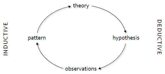
Last year I went looking for an “inductive-deductive loop” image (I was trying to convince stone-cold scientific method biologists that it really is okay to start science from observations), but I couldn’t find anything close to the simple diagram I was envisioning.  So, I drew my version on a Post-it note, and I’m sharing it now for posterity and for Google Images.

My talking point here is that scientific inquiry is both inductive and deductive.  Although many disciplines privilege a single type of reasoning, it’s better to integrate both approaches. With a circular view, we are free to enter problems where it’s most straightforward to start them — exploring the data, taking hypotheses or patterns to their conclusions, or considering how known theories might manifest — knowing that we’ll do a complete investigation in the end.  We trace as far as we can through the loop, verifying our interpretations through multiple methods.  Sometimes we cycle around the loop multiple times.

For instance, if you’re heavy on data and light on abstractions, you might start by trying to find patterns in the observations.  Once you identify some patterns, you formalize those patterns into a theory.  Given theory, you can generate some hypotheses based on the implications of that theory.  You then collect more data to disprove those hypotheses.  The new observations might suggest new patterns, starting another round of the loop.  You don’t limit yourself to collecting data only to disprove hypotheses, though — you also look at data that hasn’t been deliberately collected under the premises required by your hypotheses.  By looking at all the observations, you can start to investigate when the premises themselves hold.

The inductive-deductive loop is the structure of scientific inquiry.

Theory produces Hypothesis produces Observations produces Pattern produces Theory; the first three are deductive; the last three are inductive

Calculating and visualizing standard deviations in two dimensions

The spread of points in one dimension is easy to calculate and to visualize, but the spread of points in two (or more) dimensions is less simple. Instead of familiar error bars, standard deviational ellipses (SDEs) represent the standard deviation along both axes simultaneously. The result is similar to a contour line that traces the edge of one standard deviation, as on a topographic map or an isochore map. The calculation of a standard deviational ellipse can be tricky, because the axes along which the ellipse falls may be rotated from the original source axes.

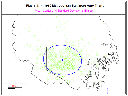
Figure 4.14 from CrimeStat III -- points representing locations of car thefts in Baltimore, with an ellipse indicating the highest density of thefts.
The standard deviational ellipse algorithm is described here and here, and it was implemented in aspace, an R library for geographic visualization work developed by Randy Bui, Ron N. Buliung, and Tarmo K. Remmel. The SDEs are calculated by calc_sde and are visualized by plot_sde. (The people who are most interested in multi-dimensional standard deviations seem to be geographers visualizing point data; an example of visualizing auto theft in Baltimore appears at right.)

The aspace SDE implementation is a very useful implementation.  I’m going to talk about implementing three extensions to it:

  • Giving better example code for how to use the package.
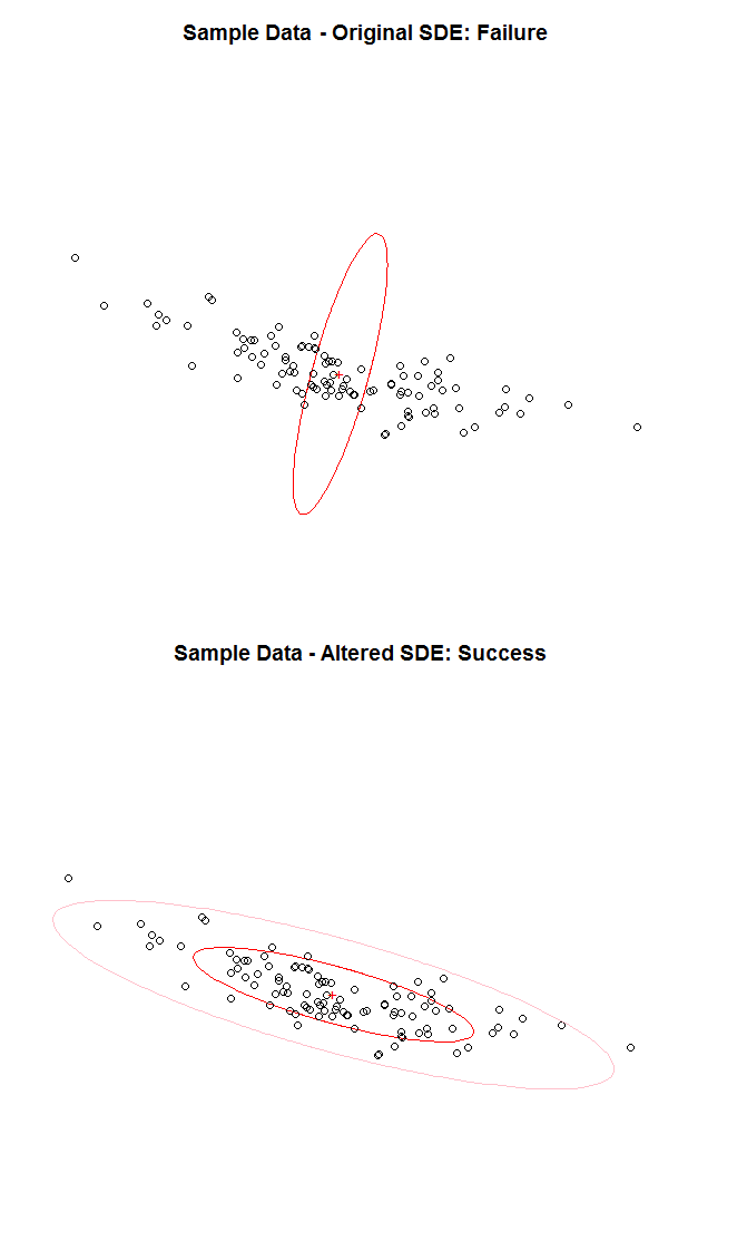
  • Fixing a bug in which the ellipse is often incorrectly rotated by 90 degrees. [This has been fixed by the authors in aspace 3.2, following contact from me.]
  • Adding a feature that shows more than one standard deviations.

This post addresses each in turn.

More Thorough Example Usage Code for aspace::plot_sde

plot_sde doesn’t take the result of calc_sde as a parameter, and its documentation doesn’t indicate how R knows which SDE to draw. To draw an SDE, run plot_sde immediately after calc_sde. R uses an implicit object hidden from the user to pass data. A better usage example is:

# Example aspace::calc_sde and aspace::plot_sde Code
library(aspace)
# Create the data and rotate it
x = rnorm(100, mean = 10, sd=2)
y = rnorm(100, mean = 10, sd=4)
t = -pi/4 # Illustrates normal case (rotated to right from vertical)
#t = pi/4 # Illustrates the bug described below (rotated to left from vertical)
transmat = matrix(c(cos(t),-sin(t),sin(t),cos(t)),nrow=2,byrow=TRUE)
pts = t(transmat %*% t(cbind(x,y)))
# Create the plot but don't show the markers
plot(pts, xlab="", ylab="", asp=1, axes=FALSE, main="Sample Data", type="n")
# Calculate and plot the first standard deviational ellipse on the existing plot
calc_sde(id=1,points=pts);
plot_sde(plotnew=FALSE, plotcentre=FALSE, centre.col="red",
         centre.pch="1", sde.col="red",sde.lwd=1,titletxt="",
		 plotpoints=TRUE,points.col="black")
# Label the centroid, explicitly using the hidden r.SDE object that was used in plot_sde
text(r.SDE$CENTRE.x, r.SDE$CENTRE.y, "+", col="red")

The above code will plot the data without axes, layering the SDE ellipse on top of a plot that does not display data markers (as illustrated at below right).

Correct Visualization Regardless of Major Axis
Original ellipse is off by 90 degrees from the scattered points; improved ellipse is not.

14 August 2012: This has been fixed by the authors in aspace 3.2 following contact from me.

The aspace 3.0 calc_sde code (accessible by typing the function name without parentheses at the R prompt) includes the lines:

if (tantheta < 0) {
	theta <- 90 - atan_d(abs(tantheta))
} else {
	theta <- atan_d(tantheta)
}

This code seems to aim to ensure that theta is a positive number — but the first line doesn’t ensure that. Instead it causes negative rotations to end up at 90 degrees to where they should be (as in the illustration at right). Instead that first if-clause could be:

if (tantheta < 0) {
	theta <- 180 - atan_d(abs(tantheta))
} else {
	theta <- atan_d(tantheta)
}

This code is one of multiple options that fixes the off-by-90-degrees issue.

Display of Multiple Standard Deviations

The aspace 3.0 calc_sde code only will only trace an ellipse of one standard deviation in each direction. To change this, add a multiplicative factor to sigmax and sigmay immediately before (or immediately after) the following lines:

if (sigmax > sigmay) {
	Major <- "SigmaX"
	Minor <- "SigmaY"
}
else {
	Major <- "SigmaY"
	Minor <- "SigmaX"
}

For instance, to calculate (and therefore plot) two standard deviations around the centroid, add in the lines:

sigmax=sigmax*2
sigmay=sigmay*2

These lines double the length of the single-standard-deviation major and minor axes.


Updated 2012-08-14.